Case study — Chick-fil-A Evergreen · AKQA

Geography as emotional storytelling

An illustrated interactive map microsite for a holiday campaign — built and shipped during the first pandemic holiday season. Warm, place-rooted, handcrafted.

Timeline2020
RoleUX & Visual Design
StatusShipped
DisciplinesData VizVisual DesignMotion

A small, beautiful thing

How do you make a map feel warm? How do you use geography as emotional storytelling rather than navigation?

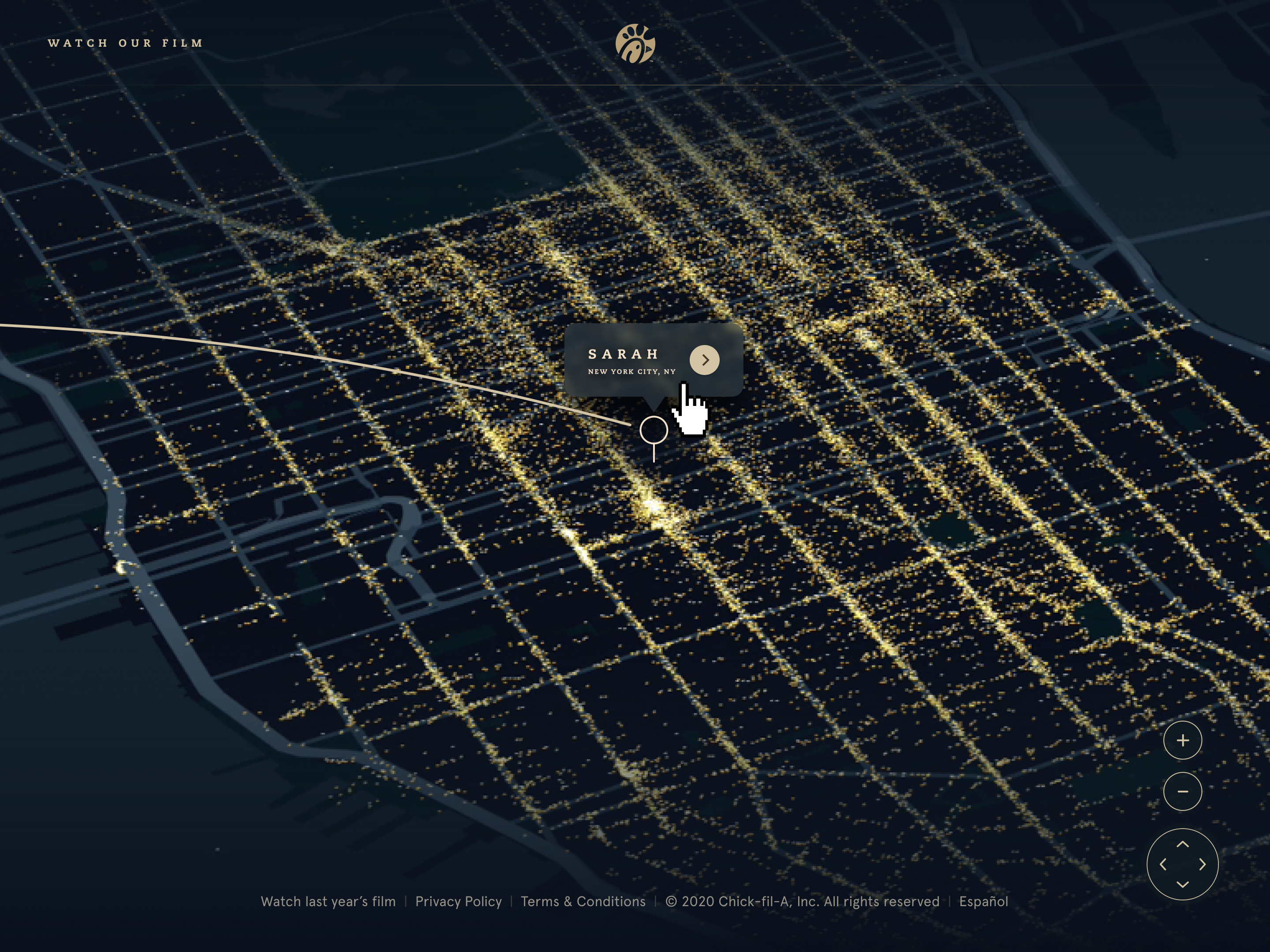
Desktop view of a dark illustrated city map glowing with thousands of golden points of light. A thin light trail arcs across the map to a pin with a popup reading 'Sarah, New York City, NY'.
A sent spark arrives: a trail of light crosses the illustrated night map to its recipient's pin. Production Figma frame from the Spark Hope and Light the Way microsite.

An interactive map microsite for Chick-fil-A's Holiday 2020 campaign. The concept: an expressive, illustrated map that told a warm, place-rooted story at a moment when people were thinking hard about home, distance, and belonging.

The first pandemic holiday season was a precise context. People couldn't travel to the places and people they loved. Evergreen leaned into that — not as sentiment, but as a genuine understanding of what the audience was feeling and what they needed from the moment. A map that felt like going somewhere, even when you couldn't.

The work was a collaboration between two agencies. I handled UX and visual design at AKQA, in close partnership throughout with an animator based at a different studio. Tight timeline, cross-agency coordination, and a project that had to feel handcrafted in a year when nothing else did.
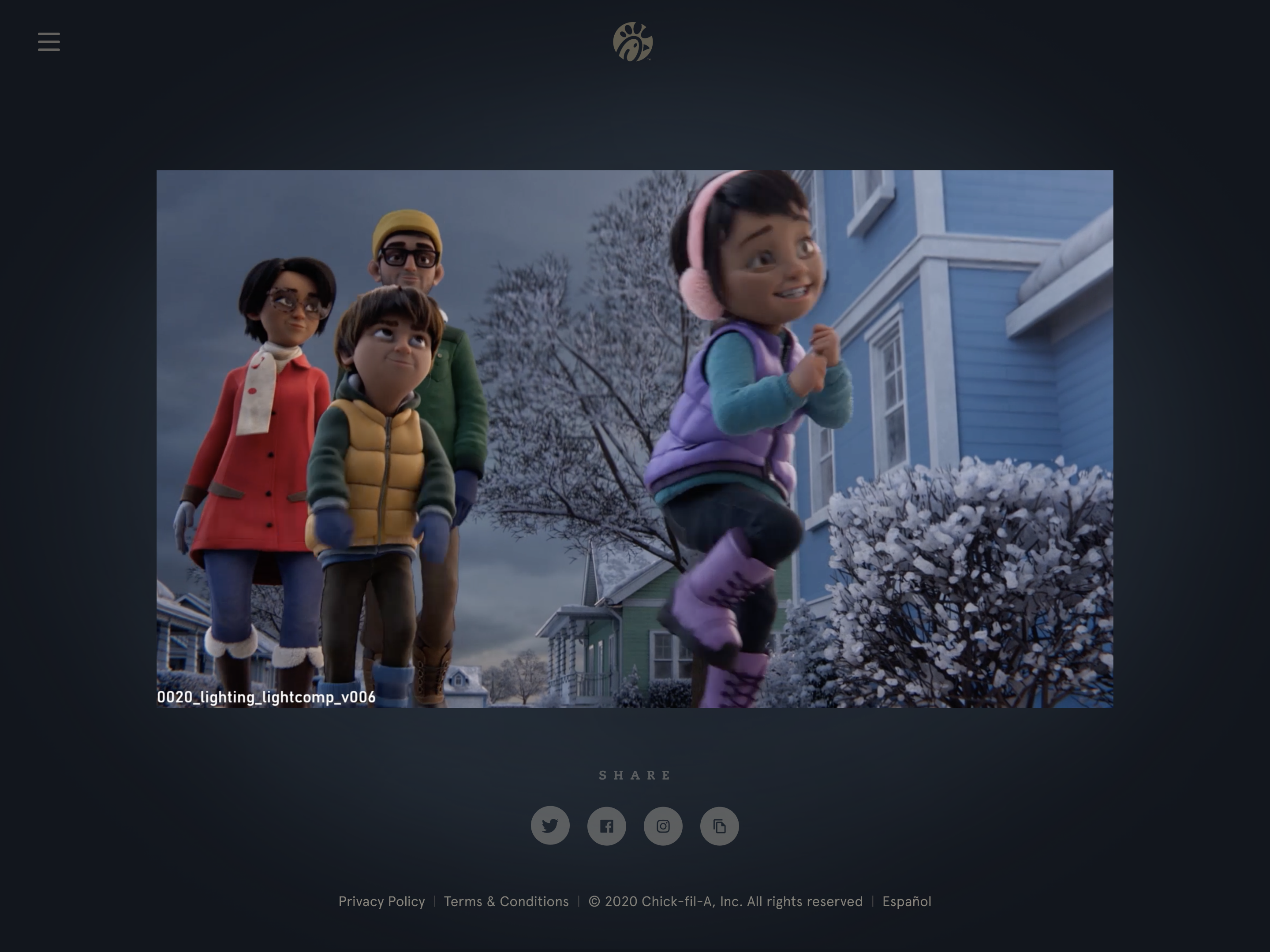
Film viewing page from the microsite: an animated still of a family in winter coats watching a girl in pink earmuffs run past a snowy blue house, with social share icons beneath the player.
The film viewing page — the animated campaign film, produced with a partner studio, framed inside the microsite with share actions below.

When the work speaks for itself

The design challenge was primarily expressive. The illustrated map style, the motion design, and the interaction model all had to cohere into something that felt genuinely crafted — not a product, not a campaign asset, but a small, beautiful thing.

The data visualization here sits at the opposite end of the register from Starchart's map module. Starchart's maps are minimal by design — one line, one region, maximum signal. Evergreen's map is maximal by intent — warmth, texture, illustration, motion, place as feeling. Both are visualization problems. The difference is what the person on the other end needs to experience.
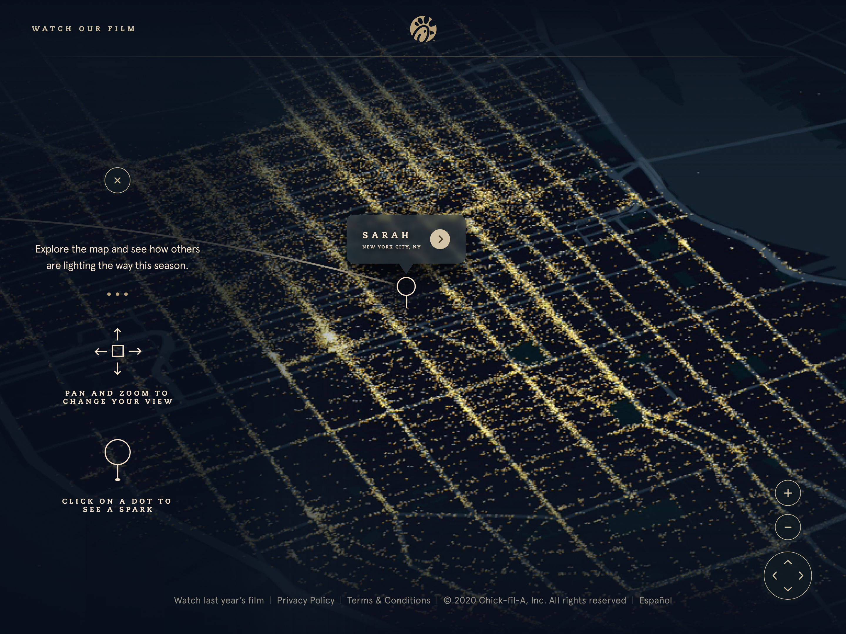
Map view with a first-visit overlay: 'Explore the map and see how others are lighting the way this season,' with icons instructing users to pan and zoom to change the view and click on a dot to see a spark.
Onboarding the interaction model — pan and zoom to explore, click a dot to see a spark. Each golden point is a message someone sent.
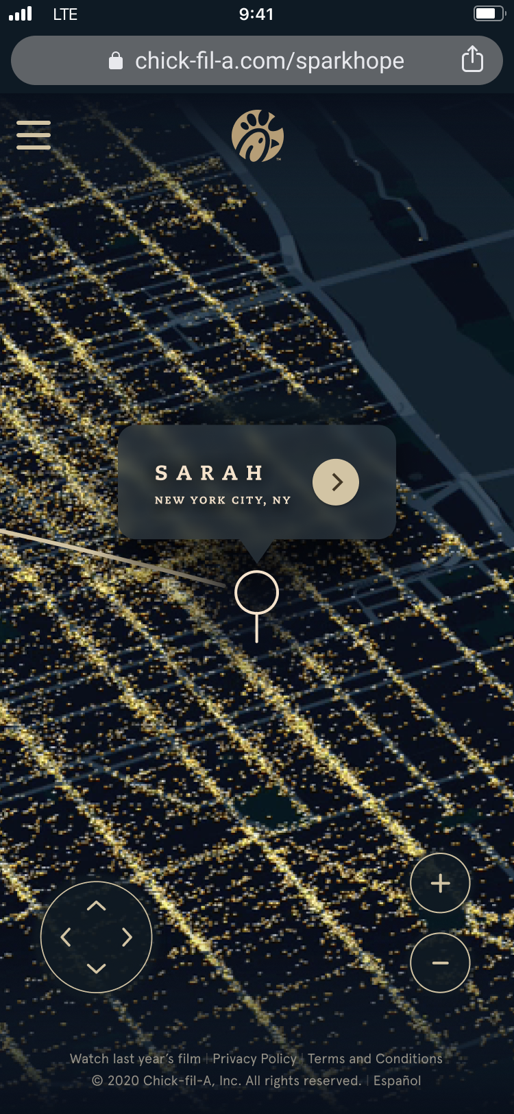
iPhone view of the map at chick-fil-a.com/sparkhope: the glowing illustrated map with a pin popup for 'Sarah, New York City, NY' and on-screen pan and zoom controls.
The mobile map at chick-fil-a.com/sparkhope — the same warmth at phone scale, with touch-friendly pan and zoom controls.

Cross-agency coordination on a tight holiday timeline, shipping something expressive in a year that didn't feel very expressive — that took a particular kind of craft focus. You can't make a map feel warm by following a process. You have to actually care about the outcome.
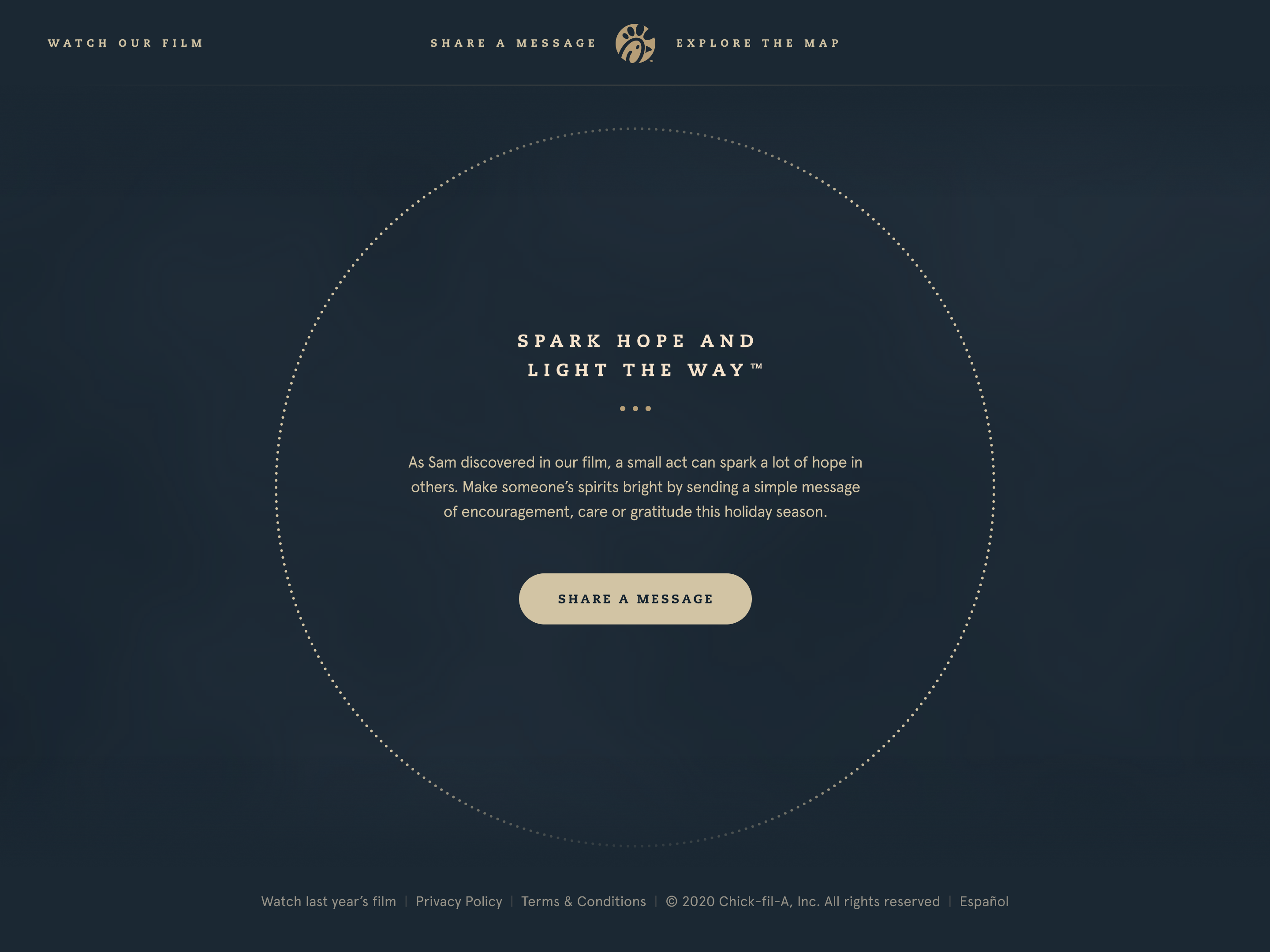
Intro page with 'Spark Hope and Light the Way' set inside a dotted circle, copy inviting visitors to send a message of encouragement, a 'Share a Message' button, and the site's header and footer navigation.
The Share a Message entry point, with the global header and footer — Watch Our Film, Share a Message, Explore the Map.
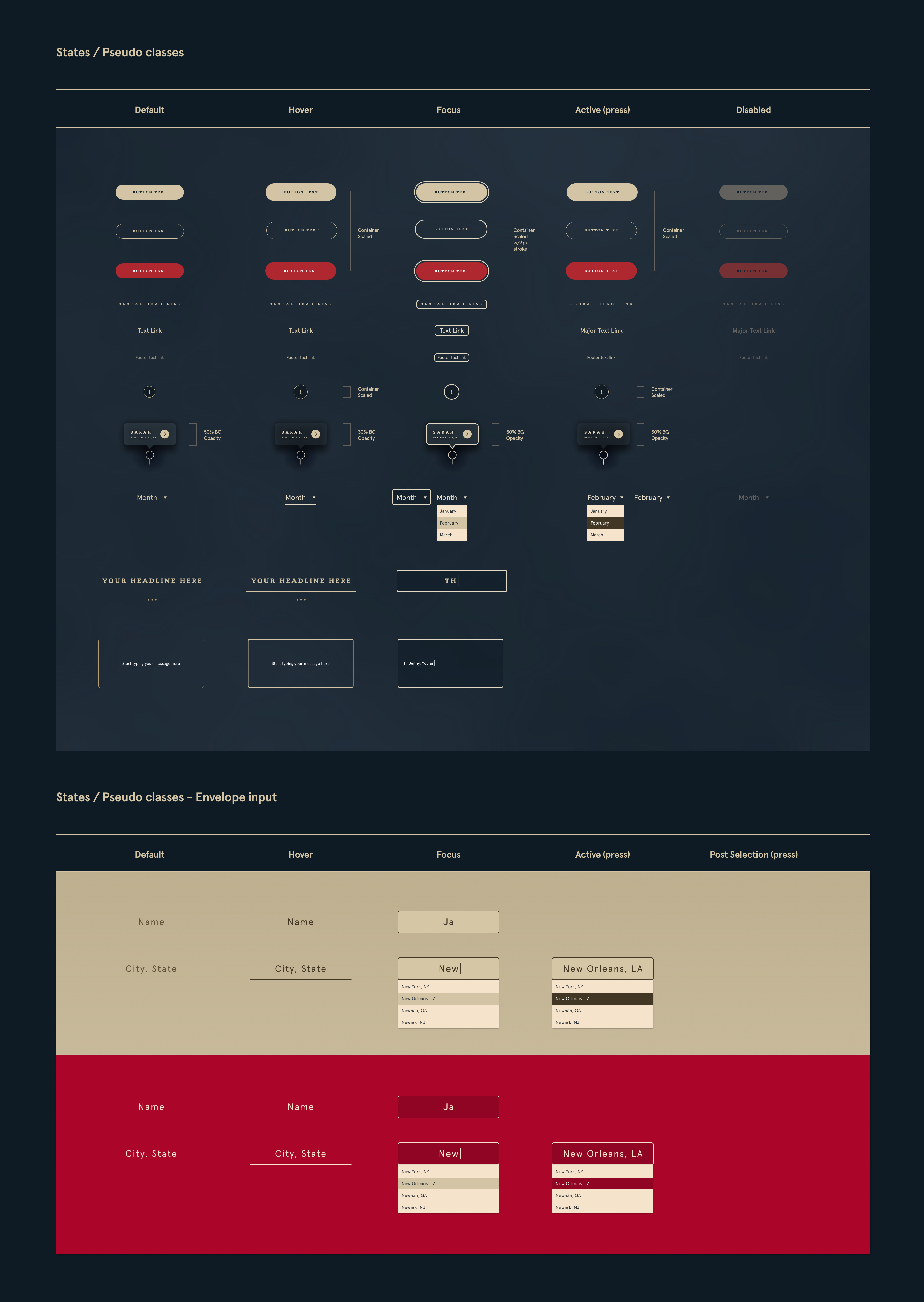
Component states specification sheet: default, hover, focus, active, and disabled states for buttons, links, map pins, and dropdowns, plus envelope input states shown on cream and red backgrounds.
States and pseudo-classes spec for every component, down to the envelope input — the unglamorous half of making a handcrafted thing shippable.